REBRANDING

Final Bottle Design
The project was assigned with the challenge of selecting an existing brand and reimagining its packaging. I chose 1800 Tequila, a brand deeply rooted in Mexican heritage, for this redesign. The decision to rebrand 1800 Tequila was driven by a desire to more prominently represent and celebrate Mexican culture within its packaging. The objective was to revitalize the brand's visual identity, connecting it more strongly with its Mexican origins, and to make the packaging more appealing and relevant in the modern market.
DESIGN PROCESS
Bottle Redesign
Utilizing Illustrator's 3D capabilities, I meticulously crafted the bottle design, prioritizing both aesthetics and functionality to deliver a distinctive tactile experience. Once the 3D model was finalized, I proceeded to enhance its visual appeal in Photoshop, incorporating realistic textures to elevate the overall presentation and appeal of the design.

Logo Redesign
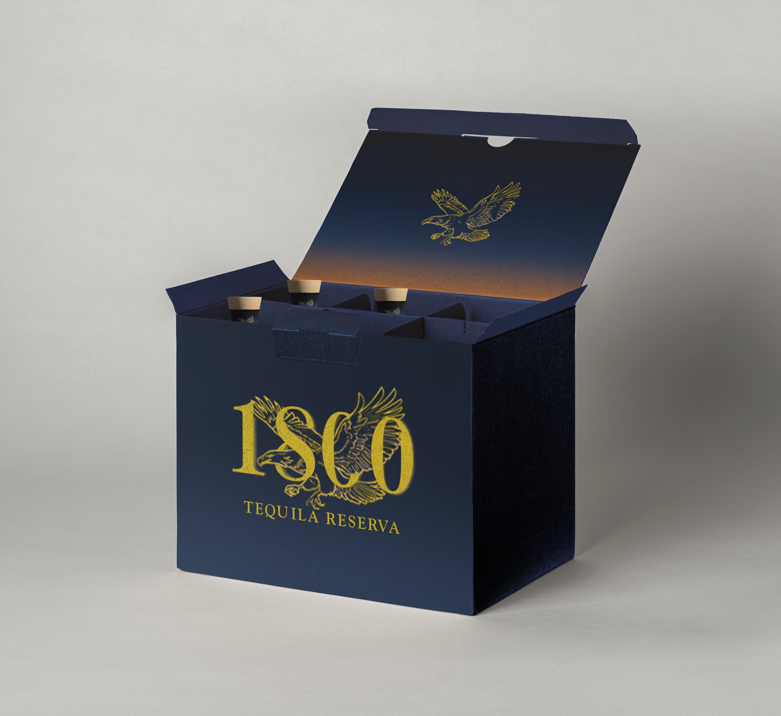
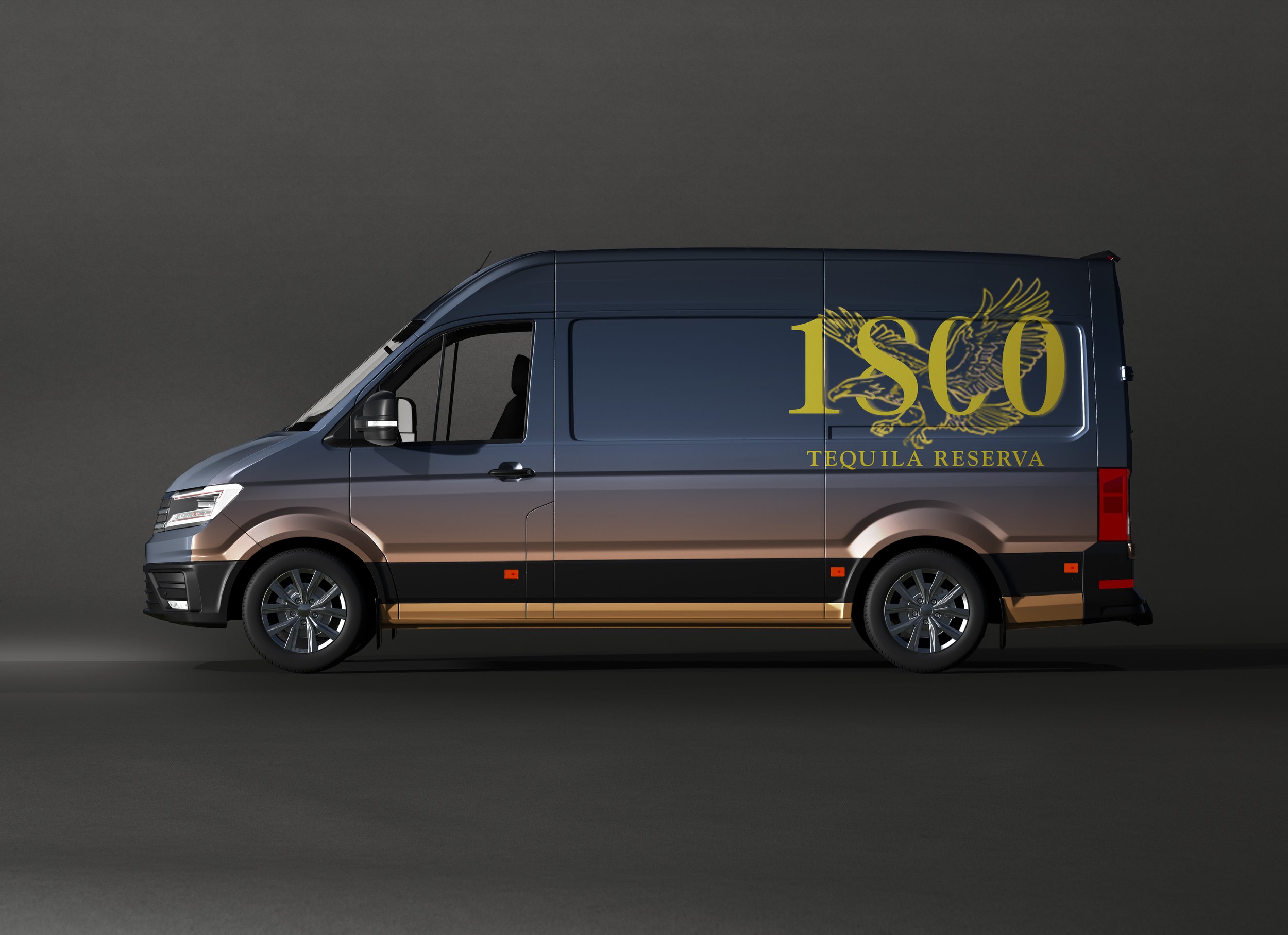
In the logo's redesign, an eagle was prominently featured, drawing inspiration from the Mexican flag which symbolizes strength and heritage. This addition not only honors the cultural significance of the eagle in Mexico but also strengthens the brand's connection to its origins, infusing a sense of authenticity and resilience into 1800 Tequila's identity.

Color Palette
The color palette, inspired by Mexican landscapes' rich earth tones, symbolizes the brand's deep connection to its heritage. I designed original Mexican-themed illustrations for the bottle, creating a visually captivating and culturally meaningful presentation. The background gradient transitions from dark blue to yellow, enhancing contrast and accentuating the vibrancy of the logo and illustrations.

Mockups